Color of the Year

Embracing Peach Fuzz: Pantone's 2024 Color Palette Unveiled

 From Celeb Endorsements to Home Palettes, Exploring the Versatility of Pantone's Choice


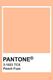
It's that time of year again when Pantone announces their color pick for 2024. This year, they've chosen a lovely, gentle tone called Peach Fuzz, and we are going to tell you all about it. 

The color is already being adopted by celebrities such as at Taylor Swift and The Rock, which means you can be sure to see it widely spread throughout the year.


Color of the Year 

Peach Fuzz is a soft and velvety peach color that Pantone says “ echoes our yearning for closeness and connection, a color radiant with warmth and modern elegance.”  


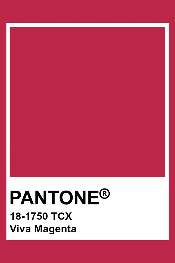
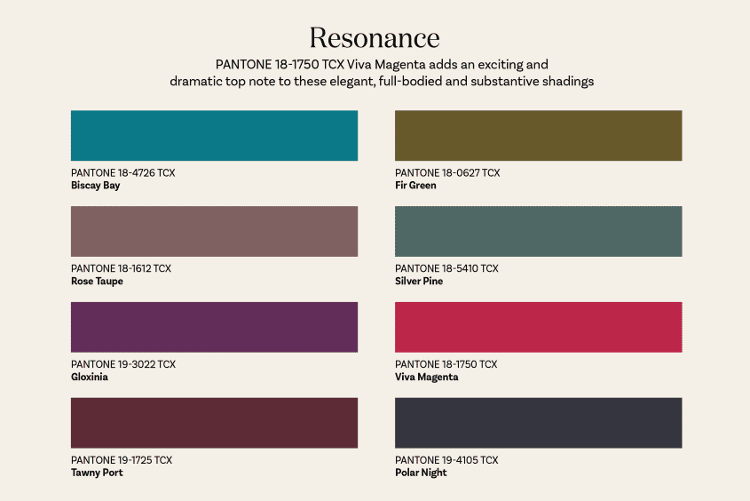
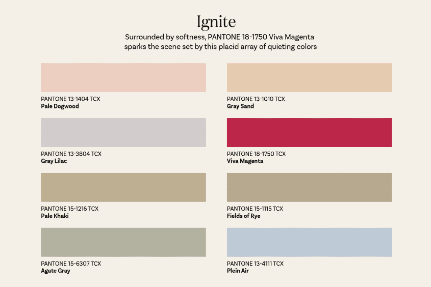
Peach Fuzz is less bold than Viva Magenta of last year, but that's intentional. Viva Magenta was supposed to evoke power and grace as our world emerged from the pandemic and had to grapple with social unrest all around. Peach Fuzz, though, reflects our need for calm and rest. To remind us of our connection to one another in a year that's already being rocked with war and rising tensions. 


According to Pantone's Leatrice Eiseman, “Peach Fuzz captures our desire to nurture ourselves and others. The velvety, gentle peach tone, whose all-embracing spirit enriches the mind, body, and soul. It is a shade which resonates with compassion, offers a tactile embrace, and effortlessly bridges the youthful with the timelessness.“ 


Pantone’s Way of Choosing the Colors 

2024 marks the 25th year of Pantone choosing their color of the year. According to Lori Pressman, the VP of Pantone Color Institute, “Color of the Year began as a way to engage the design community around the world in a conversation about color. “ Experts on color will look at more than just media. They look at travel destinations and technologies, fashion and design, movies and art. They look to see which colors are affecting the world at this moment in time. Which ones are rising in the cultural zeitgeist, and which ones are on a downward spiral?

Leaving news forecasting tools combined with color psychology to predict coming trends. They work together to narrow down their options to just one that they feel will set the tone for the year ahead.
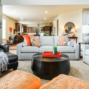


Color Palettes 

While we will undoubtedly see more color palettes pop up throughout the year,  some of the ones that we are most interested in are monochrome, vintage '80s look, a beachy palette, and a more modern palette.


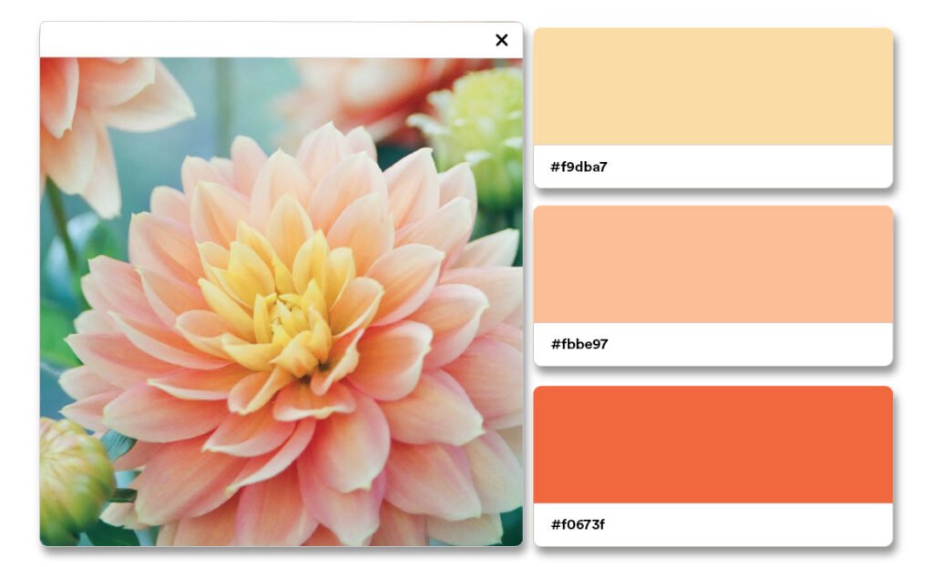
Monochrome is the most straightforward. You start by pairing peach fuzz with warm, buttery yellows, bright oranges, and soft pinks. This one is very warm and encouraging while also being soft.


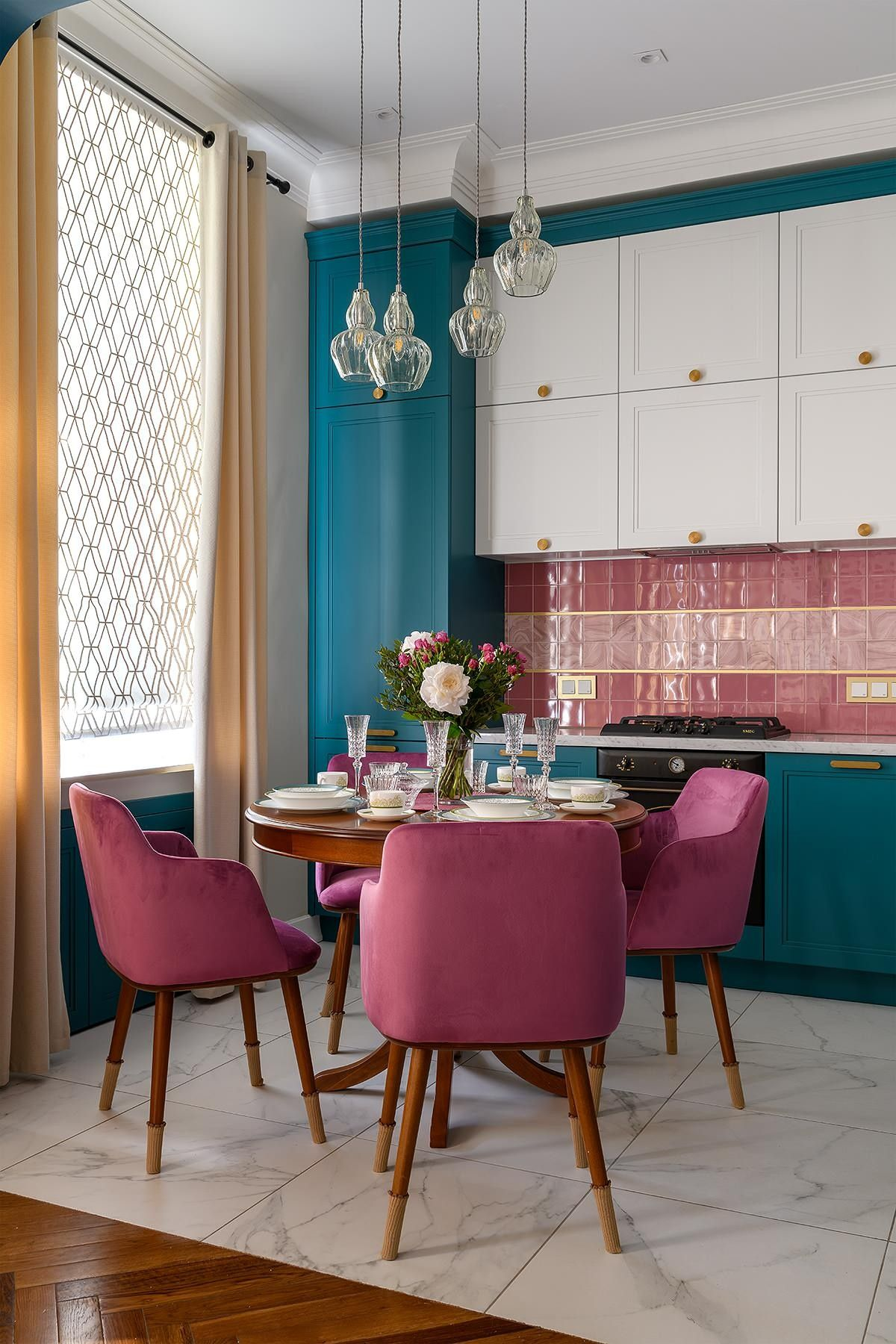
The vintage '80s palette is one that already existed. Like many colors peaches have been popular in the past. While peach fuzz specifically might not have been highlighted in the '80s, it is still very reminiscent of that time.. So if you pair it with mauve, teal, ocher and seafoam green, not only do you get a nice '80s feeling but you also get a layered and detailed palette. 


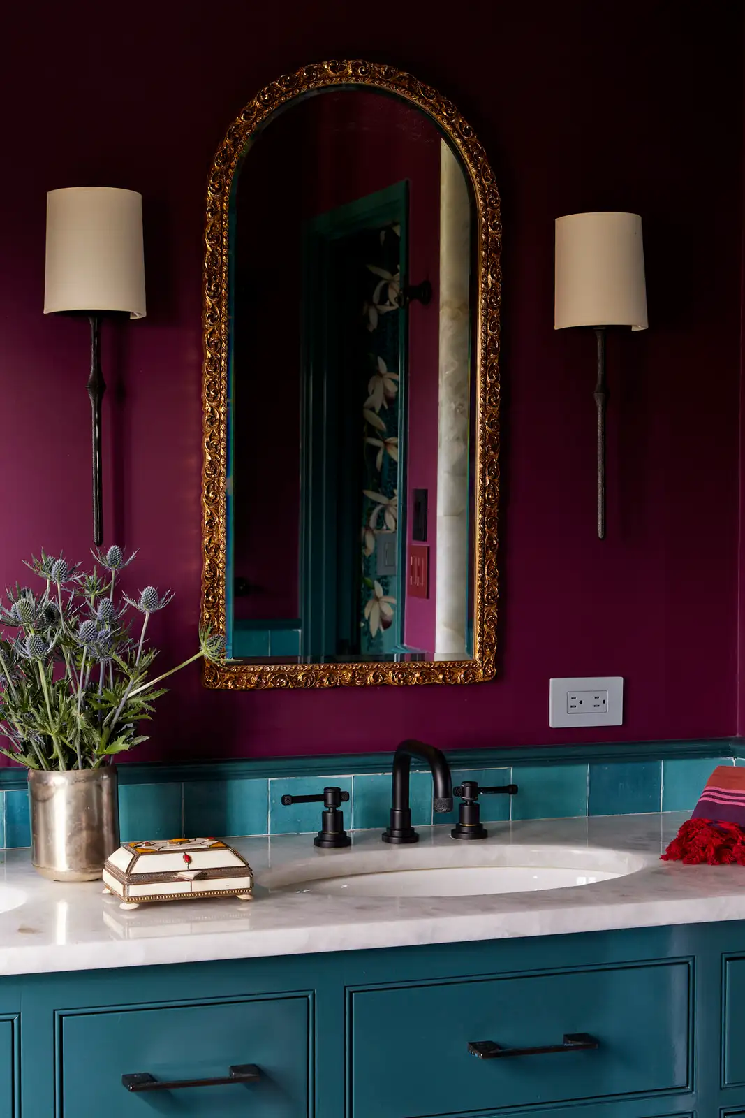
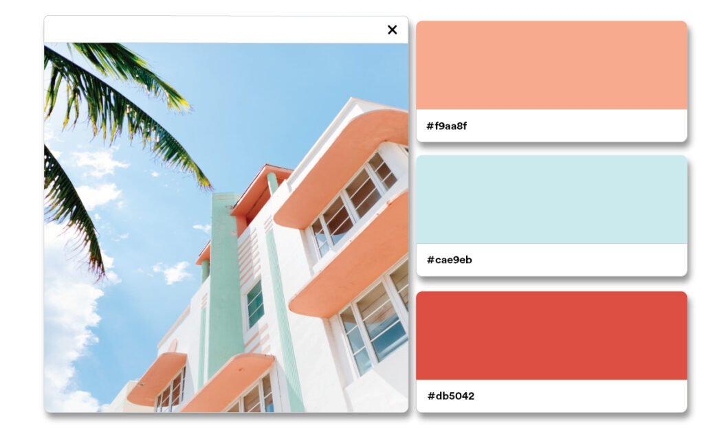
The beachy palette It is one that your blogger is rather fond of. Pair peach fuzz with deep almost carmine reds and bright blues. It has a very beach town feeling to it. We can see this one working inside or outside as is common in many beach towns.


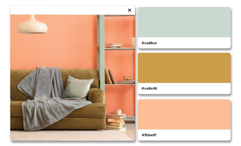
Finally, our modern palette. This one is really good for working with the minimalist decor. You start with peach fuzz, pair it with a warm gray, add in cinnabar, and crimson to bring in colors that would be on a natural peach. It's very dark but also rich and inviting without being overwhelming or decadent. 


Do you have any pallets that you are particularly excited by?


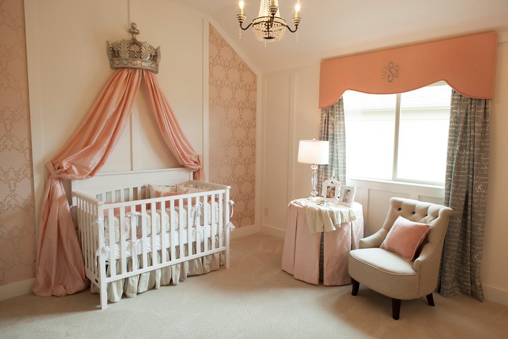
Where to use the color 


In years past we have made suggestions of specific rooms or ideas or even styles the best fit a color. However as you can tell from the pallets, there really isn't a place where peach fuzz wouldn't fit in. You could use it in your entryway, you could use it on the outside of your house. You could use it in your kitchen or you could use it in your bedroom. There isn't a place or a style that this color doesn't fit. 


Do you have anywhere specific that you are excited to use Peach Fuzz? 


Predictions from the community

Finally, we wanted to take a look at the predictions from around the community for what we might see in relation to this couple.

  • Soft diffuse colors 

  • Pastels, peaches, yellows, lilacs 

  • More tan focused warm toned looks, 

  • Continued influence from East Asian trends

  • A continuing rise of balletcore 

  • And a new surge of rococo styles


What about you? Where do you think this year's color will end up influencing trends?


As we embrace Pantone's 2024 color choice, Peach Fuzz, it's clear this gentle hue represents more than just a trend—it embodies our collective yearning for tranquility and connection. Whether it's resonating with celebrities or echoing through design, this color carries a message of compassion and timeless elegance.


We've explored its versatility across various palettes, from the warmth of monochrome to the nostalgic '80s vibes and even its suitability for modern minimalism or beachy aesthetics. It's a shade that transcends boundaries, fitting effortlessly into any space or style.


We're eager to hear your thoughts! Join us on our Facebook page to share your predictions and where you envision Peach Fuzz making its mark this year. Remember, no matter the color of your appliances, Appliance Rescue Service is here to assist. Reach out through our website or give us a call at ((214) 599-0055)—we're ready to help bring your vision to life.


Additional Reading
Viva Magenta: Color of the Year 2023 

Veri Peri: :The Color of 2022

18 Ways We're Living With Viva Magenta

Back at the beginning of the year, we talked about how Pantone's color of the year is Viva Magenta and many of you asked how you could incorporate that into your homes. We're taking a look at 18 different rooms from people across the internet both from this year and earlier who have used magenta in innovative and beautiful ways to decorate their homes.

Use Magenta Details

This kitchen is already amazing, with the cream walls and the white subway tile giving the teal cabinetry room to wow. But having little magenta details throughout the room like the rug the tea kettle and the blinds is a great way to bring this color into your home without having to do an expensive makeover. Or give up a color you already love.


A Stunning Dining Room 

You can always use color blocking to separate rooms one from another the way the magenta breaks up the dining room from the living room to the right in this room by Studio DIY. But within the space of the dining room it ties everything together, letting you know that this is one room.


Courtesy of Studio DIY

Courtesy of Rebel Walls

Use A Mural

Maybe you're not interested in doing the whole room in magenta. You can use a mural instead, like this one from Rebel Walls that not only pairs it with several other complementary colors but also shows several different shades of magenta and lets it be balanced by the White and neutral tones throughout the room. It's a way to bring in some color without overwhelming yourself.


Relaxed & Inviting

The vibrant magenta in this bathroom makes the artwork and the mirror on the walls stand out all the more add in the green from the matching bottles and the plant life and you have a very warm and inviting bathroom.

Courtesy of Decoholic

Courtesy of Kati Curtis Design & Thomas Loof

Utterly Refined


Or maybe you want a more sophisticated look for your bathroom. That's where this bathroom takes the Cake. With the long ornate mirror paired with the deep magenta of the walls, it has a very sophisticated appeal. Throw in the matching hardware for the lamps and the faucets, and the drawer pulls and you have a very refined look.

Shaping UP

If you really feel like getting crazy, this ceiling mural from Shapes For The People, is the way to go. You still have the balance of colors that work together from the teal to the magenta to the yellow and the orange, but combined with the shapes, it is a very unexpected and playful atmosphere.

Courtesy of Shapes For The People

Courtesy of 41 West

Main and Modern

On the other hand, maybe you need something vibrant in your modern bathroom. The magenta walls paired with the sterile light in this bathroom is so utterly modern, but it practically shouts the Pantone 2023 motto of “being you”.

Surprise

What about in your kitchen though? Maybe your kitchen is already full of color and light but you need some areas where it's different. That's where painting your cabinets and the underside of your Island can come in. We are all over adding splashes of color in unexpected places and doing the underside of the island like you see in this photo is one of our favorites. It is an unexpected place that most people wouldn't think to paint but it pulls the room together.

Courtesy of ANNIE SCHLECHTER

Central Focus

Maybe you're looking for a little more sedate living room but you still want something to show your personality. That's what this living room has in spades. The majority of the room is done in neutrals from the floor to the curtains the walls and even the ceiling. And then you have the couches and the tables but it's in a small enough quantity that it's balanced.

Adding In The Drama

If you need something a little more dramatic in your life this is a good source of inspiration. With the deep blue painted brick and the gold dripping down the ceiling the velvet wingback chairs POP.

Looking Up At Magenta

If you're looking to add color but you're not sure where why not look up? All of the colors in this living room work and the magenta ceiling is another neat piece in that puzzle.

Countertop Shine


Another kitchen but this time the magenta is front and center with the countertop. Instead of tying the room together the counter is the focal point drawing your eyes to it, and balanced against the wood siding it creates a vibrant yet homey feel.


Splashing Magenta Around

This cozy kitchen is a great example of how to make color work for you. Several colors are mirrored in different locations, and it ties everything together. Our favorite though is the magenta backsplash that's slightly muted. Using a colored backsplash is a great way to add small doses of color into your kitchen. Techniques like peel-and-stick or removable tiles it's even easier to try out options until you find one you like.

Upgrade Your Pantry 

If you've got a storage nook or a butler's pantry, give it an upgrade and some color! This butler’s pantry from VanderHorn Architects is a great example of just that.

Pairing the magenta with the natural wood overhead and the white framing in this nook balance each other while making it a welcoming space.


Courtesy of VanderHorn Architects

Magenta In Focus

Adding a focal wall is a great way to unify the look of your room as this bedroom shows. The magenta tiles add texture and color to the room but also add a very pop feeling that counters the more ornate headboard and settee.

Magenta In The Background


While the chairs are magenta and certainly draw your focus, we want to point out the magenta wallpaper in the background. Using the wallpaper to add a second color in the background allows you to add some pop to the room against the darker paint. It also adds a ton of personality, without taking away from the room.


Living In Jewels


This living room is like living inside a jewel box. The walls might be white, but the layers of magenta and gold offer a stunning and lavish living room that anyone could be comfortable in.


A final room that’s done in shades of magenta and gold but feels very sedate somehow. If you get how this one works, let us know!


Do you think you'll be adding Viva Magenta or similar colors to your home sometime soon? Let us know over on our Facebook page, as always, we love to hear from you.


If you're wondering why an appliance repair blog is going on about colors and decorating, don't worry; this isn't all we do. Whether it is your freshly painted washer, or your still stainless refrigerator that is giving you fits, we can help. At Appliance Rescue Service, we work with you to find a date and time that meets your needs. Will send out one of our experienced technicians to diagnose the problem and then fix it. Whether you're in McKinney, Frisco, Dallas, Allen, or anywhere in between, we are here for you. Reach out to us via our contact page or by giving us a call at ((214) 599-0055). 


Viva Magenta! Pantone Color of the Year 2023

A Showstopping Color That Gives Rise to Bold Expression and Comfort Simultaneously

It's that time of year, when everyone is excited about the new Color of the Year from Pantone.  Pantone influences many different fields including beauty, marketing, and most importantly to us, home decor and design.  


Before we show off the new color though, how does Pantone choose the color? Just how did they decide?  According to Laurie Pressman, the Vice President of Pantone Color Institute, "To arrive at the selection each year, this global team of color experts at the Pantone Color Institute comb the world looking for new color influences. This can include the entertainment industry and films in production, traveling art collections and new artists, fashion, all areas of design, aspirational travel destinations, new lifestyles, playstyles or enjoyable escapes as well as socio-economic conditions. Influences may also stem from new technologies, materials, textures and effects that impact color, relevant social media platforms and even upcoming sporting events that capture worldwide attention." Pantone created a color language that everyone across many different industries can use to ensure that everyone knows exactly what color they're talking about, and more importantly how to replicate it. They also do research across many different cultures to  find how and why colors affect us the way they do. All of this together means that they are very good at choosing colors. 


What Is The Color? 

The Pantone frame lays over the Viva Magenta swatch with the name and the color formula

Credit: Pantone

All of that said, this year's color is a showstopper. This year's color is Viva Magenta! (18-1750) A vibrant and stunning red that according to Pantone "encourages experimentation and self-expression without restraint." It is a balanced tone between warm and cool colors. Viva Magenta is a modern color for the Post-Pandemic world but one that is deeply rooted in the past.


What Does It Draw Inspiration From? 

Viva Magenta is a riff on carmine red. This is one of the most expensive and valued dyes of the natural world. It comes from cochineal insects, and their shells. Hundreds of thousands of these beetles would be collected and ground up in order to create the color, for dyes and paints. Carmine was once a major export from the Americas, and is again a rising economy in that portion of the world. 


What Colors Does It Pair Well With? 


Apartment Therapy (one of our favorite places to look for trends) put together four different palettes that they feel Viva Magenta would work well with. The first, called Resonance, is a sumptuous selection of colors that give a very rich and elegant feel to a room. Looking at them, they make us think of soft velvets, a warm fire, and a glass of wine. The second, titled Ignite, is all soft hues that Viva Magenta splashes into the middle of. If you're usually one for calmer, more relaxed environs, this might be the palette for you. The third palette is one aptly named, Family Ties. This is a palette built around the shades both brighter and darker than Viva Magenta, pinks, reds, maroons, and a soft red-grey color that we didn't think we could like and have been surprised. This one brings to mind the dining room and kitchen, with warm tones that evoke friendship, family, and community. The final palette is one titled Equilibrium, and while the other palettes have had Viva Magenta as the star, this one balances the color with others of equal vibrancy. This one is all about rich hues in very tropical tones with two softer colors to keep it from exploding into a riot.  

(Credit: Apartment Therapy)


All four of these palettes are only the beginning of what we expect to see over the next year, or more, as people play and experiment with this color. If you've already got ideas, why not show it off on our Facebook? 


Places It Might Look Good Around The Home

We think that Viva Magenta can be great just about anywhere, depending on how you balance it. If you've got a room that needs a bit more pop to it, throw in a few blankets and pieces of decor. If you're looking for something louder, try painting a wall or painting the trim in it. We could also see this as a way to paint your ceiling if you're not wanting to change up the walls but still want to add some heat to a room. There are SO many different ways that this beautiful red could fit into the home that we aren't really seeing a place where it wouldn't fit. 


An interesting side note for those of you who enjoy speculation on colors. Originally many suspected that the color Digital Lavender was going to be this year's color.  While many experts, including MSN & Architecture Digest both, reported early on this was the color, it ended up not being the case. We will say that the calmer grey-hued lavender is a very nice color, but we find that Viva Magenta is very fitting for this year and the hopes that many are bringing into the year.  


What about you? What are your thoughts on Pantone's color of the year? Will you be bringing it into your decorating? Your furniture?What about your appliances? Let us know in the comments below or over on our Facebook page. 


If, on the other hand, you're more worried about the health of your appliances rather than what color they are, we can still help with that. Reach out to us on our contact page or by giving us a call at ((214) 599-0055). We'll work with you to find a time and date that work for your schedule and send one of our experts out on the day you choose. At Appliance Rescue Service, our goal is to get your home running smoothly again.