How To Go Big In Your Home And Bring In Color, Pattern, And Texture
This week, we’re going big, we’re going bold, we’re going maximalist. If you’re tired of coloring inside the lines or always being told only keep what you need, this decor style might be for you. Learn what maximalism is, what the elements are that make it up, and how you can bring it into your home.

Courtesy of decoredoo.

Courtesy of ksenia-chernaya
What is Maximalist Decor
Maximalist decor is a style that’s best summed up by “Be vivid, be bold, and show off your passions! ” It’s the dead opposite of minimalism. It’s about pattern and texture, color and light, and most of all, it’s about showing off the interests of the homeowner. It’s about taking what you love and showing it off, making it the highlight of the room or your home rather than just on a shelf here and there.
Maximalism can be said to have started in the Victorian era, although people argue about when and where exactly. Although it wasn’t called maximalism at the time, it was all about showing off your wealth by displaying treasures, luxurious fabrics, textures, and your collections. What’s important to understand is that although it was initially a way to show off just how rich you were, it has evolved beyond that point. It’s a fluid, individualistic style that focuses on your joy. It’s about making bold decisions on color, pattern, texture, and form when it comes to your space, blending them together into something that represents you and is striking and playful.
Some of the people most known for maximalism today are Kelly Wearstler, Martin Brudnizki, and Dorothy Draper. All of them get that maximalism isn’t just about showing off something impressive and enviable but about creating a space that is fun and brings joy.
What are some specific elements of Maximalist Decor?
- It’s clean and curated
Maximalism walks a thin line between showing off what you love and being a chaotic clutter. It’s not about filling every available space, and it’s actually better if you keep working areas like coffee tables, desks, etc., relatively clear. This bit of practicality makes the space more practical to live in rather than just look at. Part of the joy of the style is the intentional curation, after all.
- Having one or two leading features that will shape the rest of the room. These are the pieces that are going to catch the viewer’s eye. Whether it’s vivid furniture, ornate carpentry, a statement light fixture, or plant life, pick one or two to be the highlight of the room.
- Coordinating layers. Layer in the things that you love around those fixture pieces so that they echo it. It’s all about curation at this stage, so feel free to go slowly.
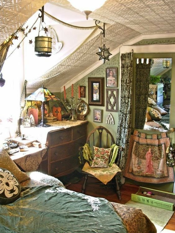
-Go bold in your color choices. When it comes to colors and maximalism, it’s all about being bold. This doesn’t necessarily mean neons; instead, it’s about choosing rich and sumptuous colors. Patterns are also always a plus, especially if you can coordinate patterns.
How can YOU bring Maximalist Decor into your home?
If you want to redo your home with maximalist decor, we suggest taking a 5 step process.
- Stop and think about it. Look at the different inspiration pictures you’ve saved and consider if you would be okay with the entirety of your home being done that way. If the answer is no? Or you’re thinking you can just do a little bit in that direction? We suggest looking at a similar style but not maximalism. Maximalism doesn’t have a ‘light’ setting. It’s all or nothing, which is sort of the point.
- Do you want each room to be a separate theme, or do you want everything to connect together? If it’s the latter, consider what your thread will be; what is going to be the same throughout every room?

Courtesy of decoredoo.
- Pick out central colors and sort things accordingly. Whether you decide to have each room be different or have a common thread, you want the rooms to be cohesive, rather than dizzying or overwhelming. We know it’s a fine line to walk, but it can be done, and part of that is picking out your united colors or color palette.
- Focus on comfort before anything else. You’re the one living here, you need to be happy with it.
-Be vivid, be bold, and show off your passions!
What about you? Do you think you could go with the maximalist look in your home? Let us know why or why not on our Facebook page!
If you wound up here because you need help with your appliances and not your interior decor, you’re still in the right space. Appliance Rescue Service serves the DFW area from Dallas to McKinney, from Coppell to Garland and everywhere in between. You can reach us by calling ((214) 599-0055) or by going to our contact page.
Some additional links you might enjoy
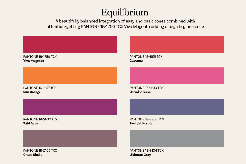
Pantone Color of the Year
Hollywood Regency Decor
Art Nouveau Decor